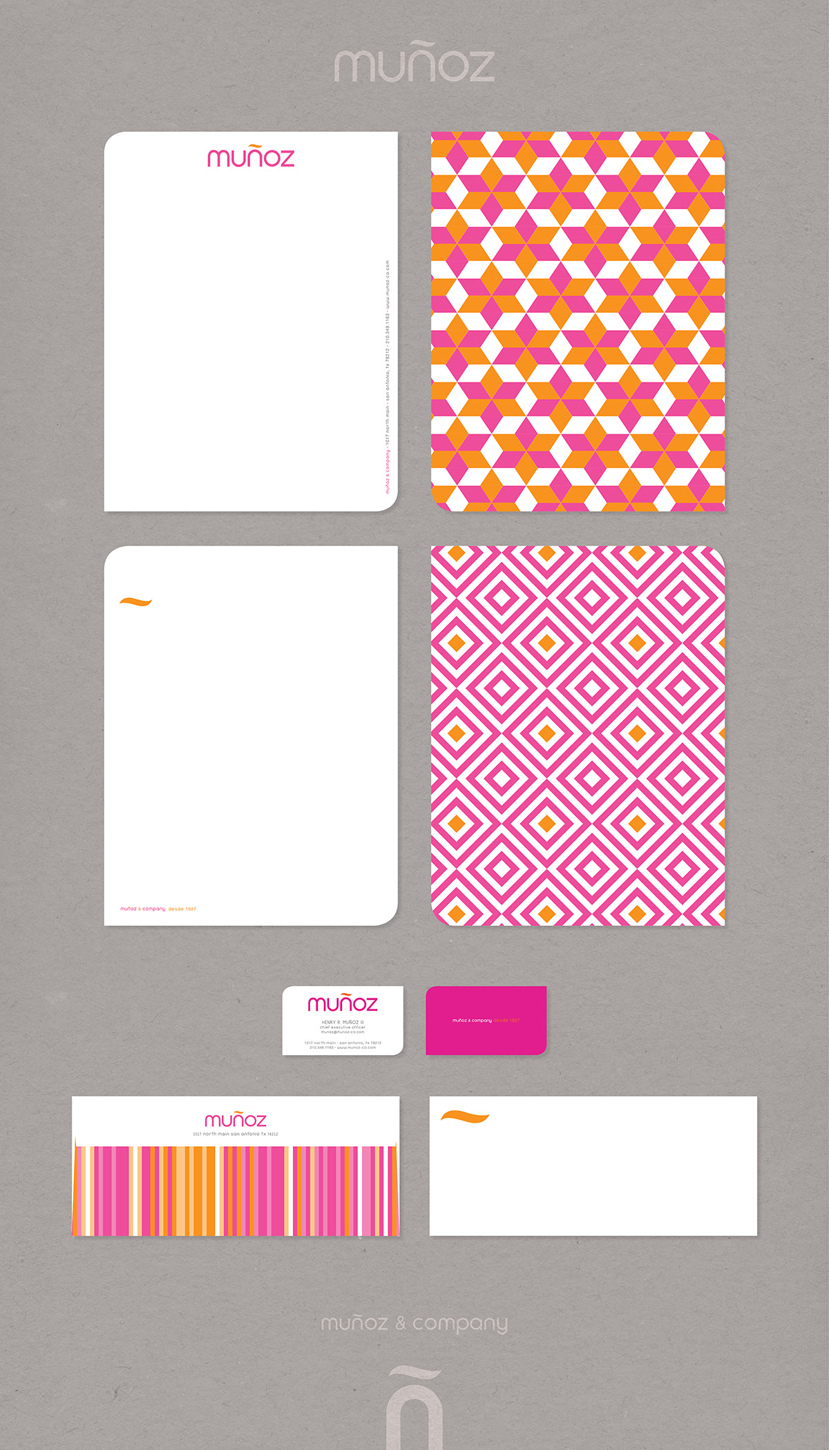
- April 09, 2013
After the once majority owner John Kell, FAIA’s retirement, Muñoz and Company, formerly Kell Muñoz Architects, sought to rebrand itself to reflect the direction the company had been moving towards. Muñoz and Company, now a Minority Owned Business, had grown to encompass much more than just architecture. Munoz and company recognized that a majority of their work represented publicly funded Hispanic Serving Institutions and had developed an approach to design that focuses on the blending of cultures. The logo an “ñ” was derived from the new name sake ( muñoz = uno = ñ ) and “e plu·ri·bus u·num” Out of Many One. The logo is indicative of an arch or “portal”, referencing both architecture and the potential for a place to serve as a gateway to a better life. The “ñ” and more specifically the tilde above the arch represent the firm’s Hispanic serving roots. The color and patterns are modern interpretations of traditional designs found in Hispanic culture. The distinct shape of the letterhead and business cards are an abstraction of the Tilde.
In 2017 Muñoz & Company celebrated it’s 90th anniversary and commemorated the event with a temporary addition of a festive piñata. 90 for 90 was conceived as an exhibition of 90 important projects the firm completed over the last 90 years.


- Branding
- Designer

